Vermeer’s techniques #1 - soft edges and rotation
In this short article, I want to highlight a subtle yet incredibly powerful technique - the use of scumbling to soften painted edges. It’s a technique that was employed by all of the great masters to beautiful effect, however to keep this particular discussion short I will focus on its use by one single artist - Johannes Vermeer.
At the end, I will show how I have employed this particular technique in some of my own work.
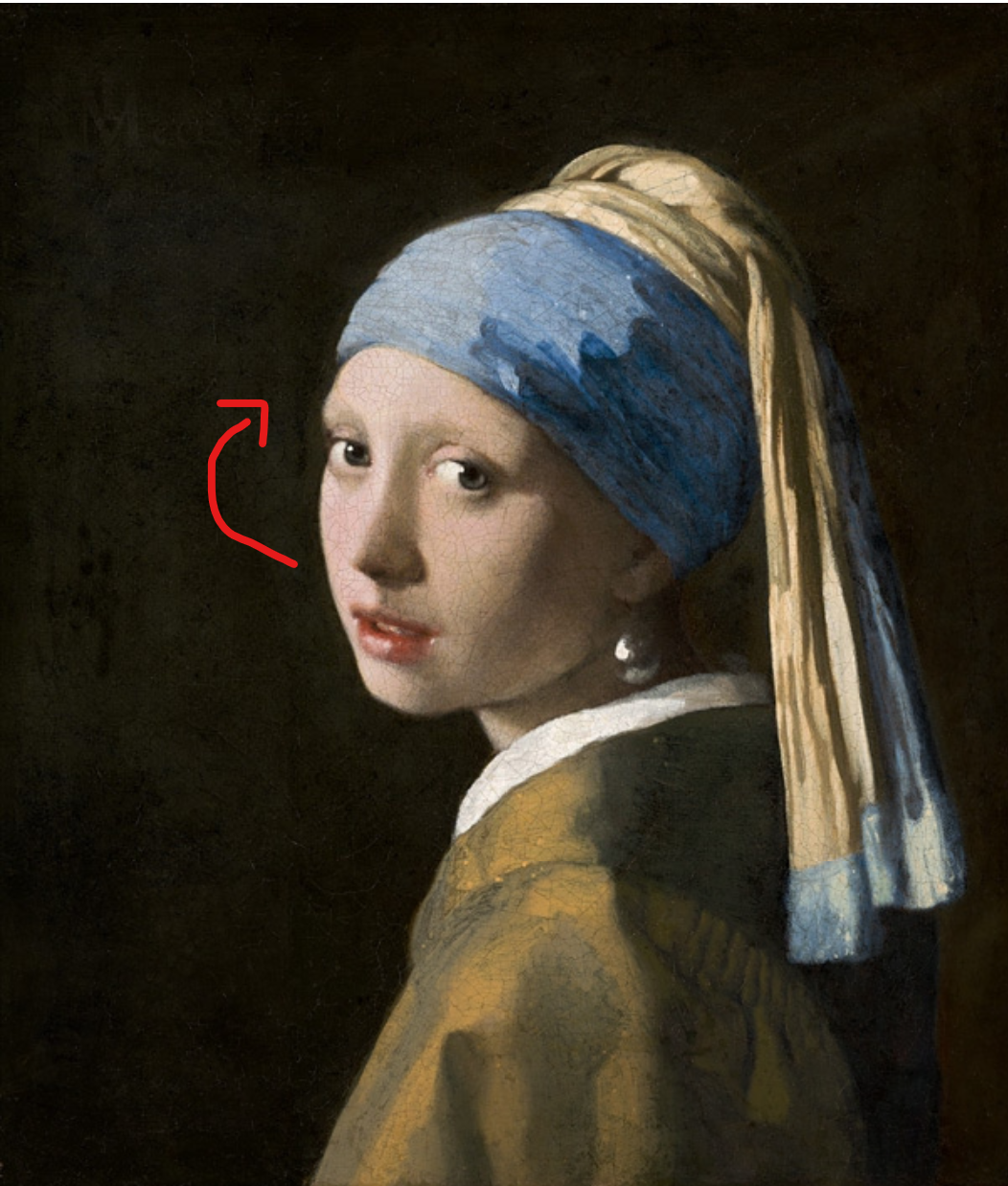
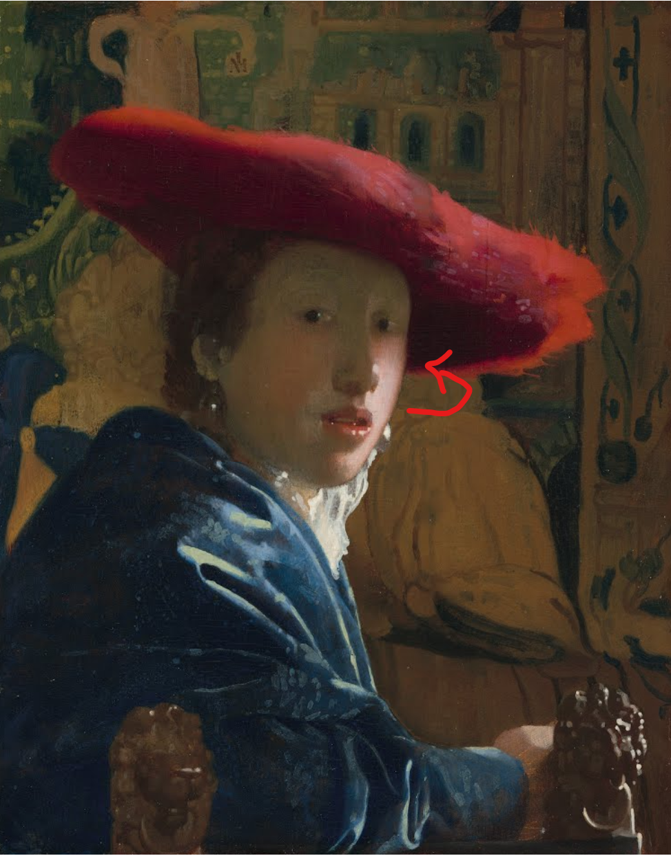
In both “The Girl with the Pearl Earring” and “The Girl with the Red Hat”, we find the outer edge of the subject’s face juxtaposed against the background - especially in the Girl with the Pearl Earring where the face on the left hand side is directly against the dark background.
Normally, the joining of two highly different values causes a visual delineation at the boundary - something that often causes the particular edge to advance out of the page. That is, the side of the object with the high contrast comes forwards towards the viewer. This is why you will often see the side of the face in a portrait on the shadow side also being the side of the face turned away from the viewer. However in both of Vermeer’s pictures above, the light side is actually turned away from the viewer and into the canvas. So, how does Vermeer still achieve the necessary rotational effect?
The key is the use of soft edges. That is, an edge where the two colours (or more importantly, values) gently transition from one into the other and are not simply delineated by a strong line. I talk more about edges in painting techniques here.
How does Vermeer soften his edges?
In these particular cases, Vermeer very gently applies scumbling of the flesh tone along the edges of these portraits. Let’s take a closer look.
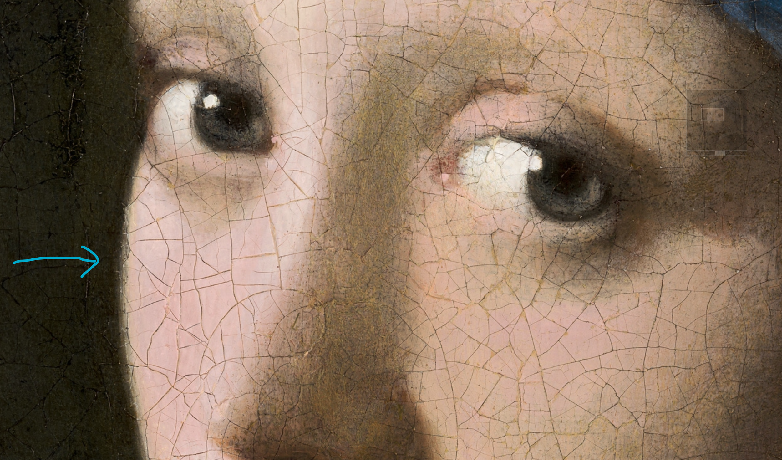
In the first picture above, I show the left hand side of the Girl with the Pearl Earring. Look closely (blue arrow) and you will see a gentle “fuzzyness” along the edge of the girl’s face. Look even closer and you can see that this is by no means a clean line between the background and the flesh tone. At nursery school, children are berated for “going over the lines” when colouring in. For children, this is down to a lack of dexterity or concentration. In Vermeer’s case however, this is absolutely intentional when applying the skin tone.
He has done this in order to make that side of the girl’s head rotate into the page and achieve a general subtlety to the portrait. Without it you would have an awkward effect of a face drawn in semi profile, but somehow without the volume of the head actually turning. I have tried to show this turning effect with use of the red arrow in the second picture. But how (physically speaking) has Vermeer achieved this? If you really look closely at the painting (in person in the Netherlands) or on google arts and culture, you can see a line of light flesh-toned paint gently scumbled over the dark background at this edge. To apply this, it is likely that Vermeer used a reasonably stiff and dry paint (with minimal oil) and a dry brush. By gently dragging the brush over the surface, paint will adhere in areas of slight roughness. This gives a line that appears uniform (but soft) from a distance, but quite rough when viewed up close.
We see the same technique employed again in the Girl with a Red Hat, this time on the other side of the face (since this time, the light is coming from the right hand side). In the enlarged image, you can again see this rough quality to the edge - which registers as softness from a distance - causing this side of the head to turn into the canvas. Additionally, looking closely at the painting, I believe this scumble to have been achieved in a layer or two beneath the absolute top layer of the pink fleshy colour - which is then brought close to this edge, but not exactly to its end. The fact that the painting layer underneath is of lower saturation and value also adds to the softening effect of this edge. See how in both pictures, the upper skin tone layer doesn’t quite line up against the outer edge of the face painted in the underpainting underneath
Google arts and culture has incredibly high resolution pictures of these paintings, and I encourage you to take a look here by zooming right into these edges to see what I mean. (Short of being able to visit the paintings in the Netherlands of Washington, which of course would be even better!)
Applying this technique in my own work
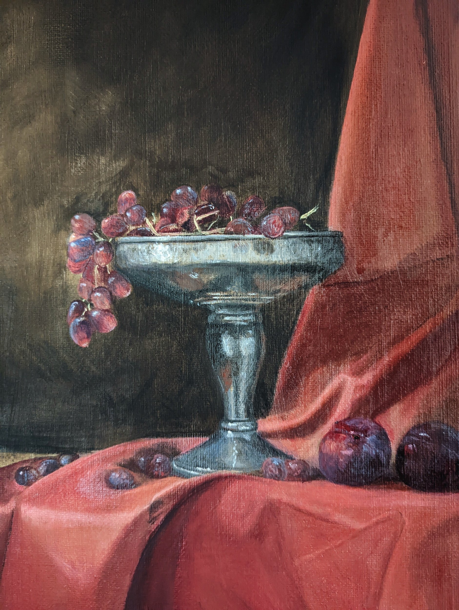
In “A Study in Scarlet” one particular region where the illusion of a receding edge is absolutely critical is the base of the pewter cup. I have taken some close up photos of the left and right hand side above. The particular edges I am talking about are highlighted (rather crudely) with the blue arrows. If the boundary between the base of the cup and the red drapery was just a straight forward “hard” edge, the base of the cup would look oddly flat and two dimensional, without giving the sense of being a cone-shape, rotating into the canvas. Therefore, in order to make this surface turn, I employed the technique described above and applied a very thin scumble of the vermilion red at the edge. From a distance, this softens the edge quality and causes a feeling of three dimensionality for the cup base. Up close, you would be forgiven for thinking that I just slipped while painting the edge - but this is all part of the illusion of painting!
Why not use another softening technique?
In principle it would have been possible to achieve a soft edge by glazing or blending the red and silver, wet into wet. However, using either of these techniques might give the subtle impression of the red cloth being in actual physical contact with the cup base (which it is not), rather than there being an empty void of space immediately behind the cup (just like the empty space behind the subjects in the Vermeers, between them and the backdrops). The edge scumbling effect here is very effective of tricking your eye into seeing the colour behind the object gently bounce off the surface before reaching your eye. The use of glazing and blending to soften edges can be seen throughout the drapery component of this painting however. Since the two surfaces are indeed touching, it is used to generate a much more realistic effect of two surfaces merging into one another. See my post here where I talk about using blue ultramarine glazes to modulate the shadows in the red drapery. Furthermore, in a composition which is inherently very simple, such as this one, the multiple variations of edge quality - and the techniques employed to generate them - compensate to engender adequate naturalistic visual complexity to satisfy the eye.
Thanks again for reading and do let me know if you have any thoughts, comments or questions in the comments section below!
