Hard and soft edges
What is a hard or a soft edge?
Artists often talk about the idea of a “hard edge”, a “soft edge”, “edge quality”, “line quality” etc. but what do all of these terms mean?
Whenever you have two colours, or more importantly two values adjacent to one another, a boundary is formed between them. If the border between these two is exact with no blending or overlap - this is called a “hard edge”. I have shown the most basic example of a hard edge between a light and dark value in the first picture above.
If however, there is an area between these two regions that somehow modulates their value, such as shown in the second image, this is called a “soft edge”. Of course, the definition isn’t a binary one and many variations between the two exist. You could have for example an extremely soft edge, such that the transition between the two values is almost imperceptible (such as on the surface of a very curved object like a sphere). You could have only a slightly soft edge, where a slight smudging between the two regions indicates that the surface is slightly curved, although not that much - for example on the corner of a desk with a slightly rounded edge. At the farthest extreme, you have an extremely hard edge - such as the one shown above - which could be used for a light, flat object directly on a dark background, or a sharp 90 degree angle on the edge of a box.
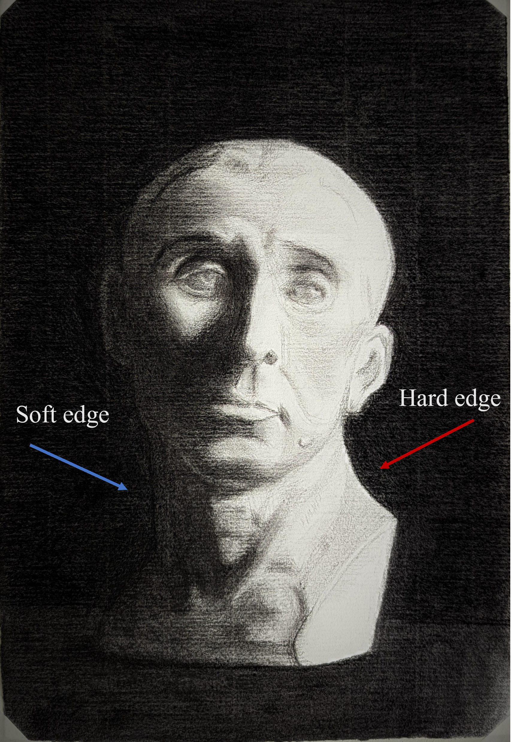
From “Study of bust of Niccolò da Uzzano”. Showing the use of hard and soft edges. The soft edge (blue arrow) turns that side of the bust into the canvas while the hard edge (red arrow) makes the light side pop out of the canvas.
How edges are used
Typically, hard edges advance and soft edges recede. That is, a soft edge will typically cause a “side” or an object to recede backwards into the picture; whereas, a hard edge will pull that object out. This can be thought of sometimes as moving objects in and out of focus.
I show how both types can be used on a single object to give this effect. The image above shows a charcoal drawing I did of a bust of Niccolò da Uzzano. On the left hand side, I have achieved an almost imperceptible edge between the side of the cast and the background. This is achieved by blending the black of the background with the very dark value of the cast shadow on the cast. From a distance, this gives the effect of this side of the cast vanishing backward into the paper.
Conversely, on the right hand side (the light side), I intentionally have a very hard edge between the side of the cast and the background. This not only accentuates the brightness of the light falling on the cast, but causes this side to advance out of the paper - giving the overall illusion of rotation. Alternatively, if both sides of the drawing had a hard edge, this would likely give the effect of flatness, and not the desired sense of three dimensionality. (You can see this two dimensionality for example in Japanese woodblock prints, which by virtue of the woodblock medium, the edges of all objects are hard and delineated, adding to the two-dimensional appearance).
How to control edges
There are an almost limitless number of ways to change the quality of your edges in a picture, however I will list some of the more common ones below:
In drawing
Smudging (with your finger or a stump)
Cross hatching over a boundary
Using a series of lines that are in a different direction to the overall line to form a boundary (particularly good for musculature in figurative drawings)
In oil painting
Blending with a soft dry brush
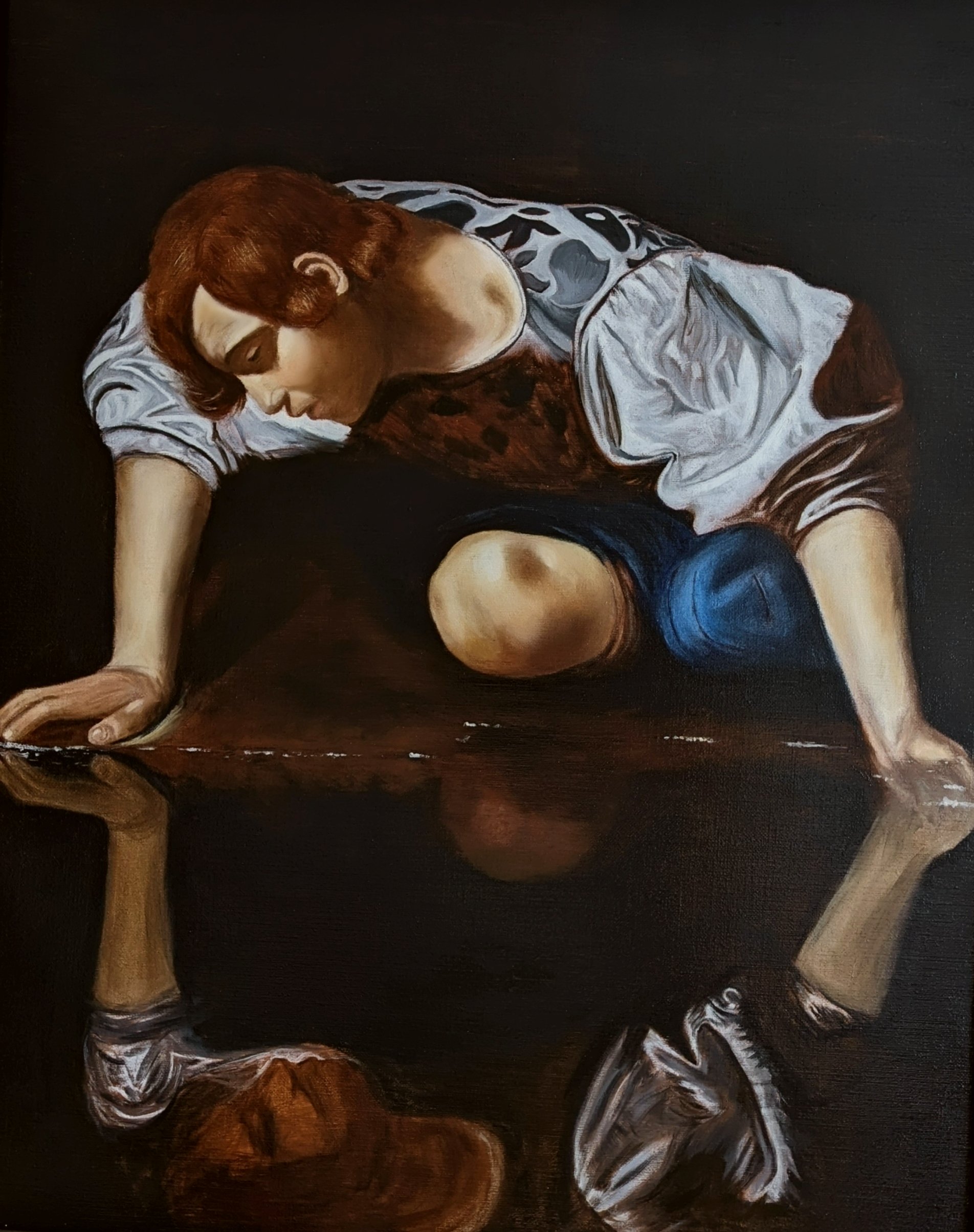
Overlapping opposite areas in the underpainting (I will do a separate post on this specific technique, often employed by Vermeer)
Scumbling over the boundary (a favourite of Rembrandt and Constable)
Glazing over the boundary
Next time
…you’re at a museum - keep an eye out of how the great masters use a mixture of hard and soft edges to achieve various effects and how they use different techniques to achieve them. How objects in a landscape are pulled in and out of focus, how the sense of rotation is achieved in portraiture, and how solid block-like objects are defined compared to soft round ones.


